A centralized design system is necessary in an enterprise-level application in order to align teams, speed up the design and development process, improve brand perception and user trust, and promote accessibility.
Atomic Design Methodology is a great fit for this purpose as it is based on modularity and has been inspired by the chemistry of atoms, molecules, and organisms. The methodology divides the design into atoms, molecules, organisms, templates, and pages, and every software and application is made up of small individual atoms that are grouped together to make different components and complex pages.
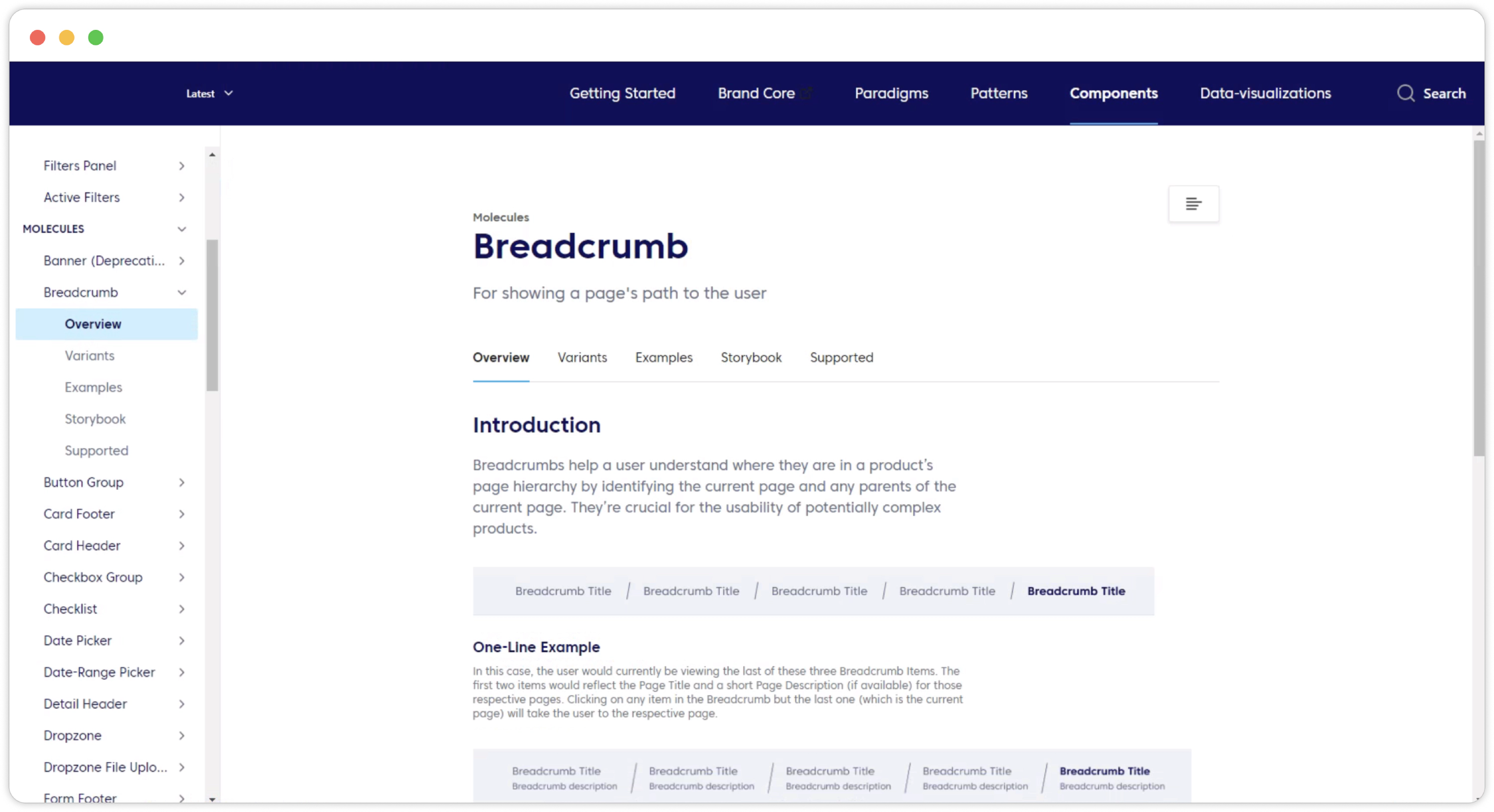
High-quality component documentation is crucial to an effective library, allowing everyone to quickly and efficiently make consistent decisions. Detailed documentation should be organized, consistent, and easy to use.
By creating an updated centralized design system, we aimed to:
- Align our teams by giving them a more structured and guided way to build products.
- Speed up our design and development process: with a ready-made library and patterns teams can create and test layouts much faster.
- Improve brand perception and user trust through consistent experiences that work for everyone and allow users to accomplish their goals.
- Promote accessibility of our products by building accessibility and inclusion into our component libraries, both from a design and code repository perspective.
Why we chose Atomic Methodology
Atomic Design Methodology is developed by Brad Frost and it is completely based on the Modularity principles and has been inspired by the chemistry of the atoms, molecules, and organisms.
Atomic Design is basically divided in the,
- Atoms,
- Molecules,
- Organisms
- Templates
- Pages.
According to the Atomic design, every software and application is basically made up of small individual atoms like buttons, input boxes, texts and they are grouped together to make different components and complex pages.
Usually, Atomic design starts at the atom level, but if you go further deeper in these atoms, then you can find that these atoms are also made up of a nucleus, electrons, and protons.
So, if we were to make a design system for this product, we always start from the inside of the atoms, which is, first defining the visual style, color guide, and typography of the system.
You can see our visual style, color guide, and typography for the above product,
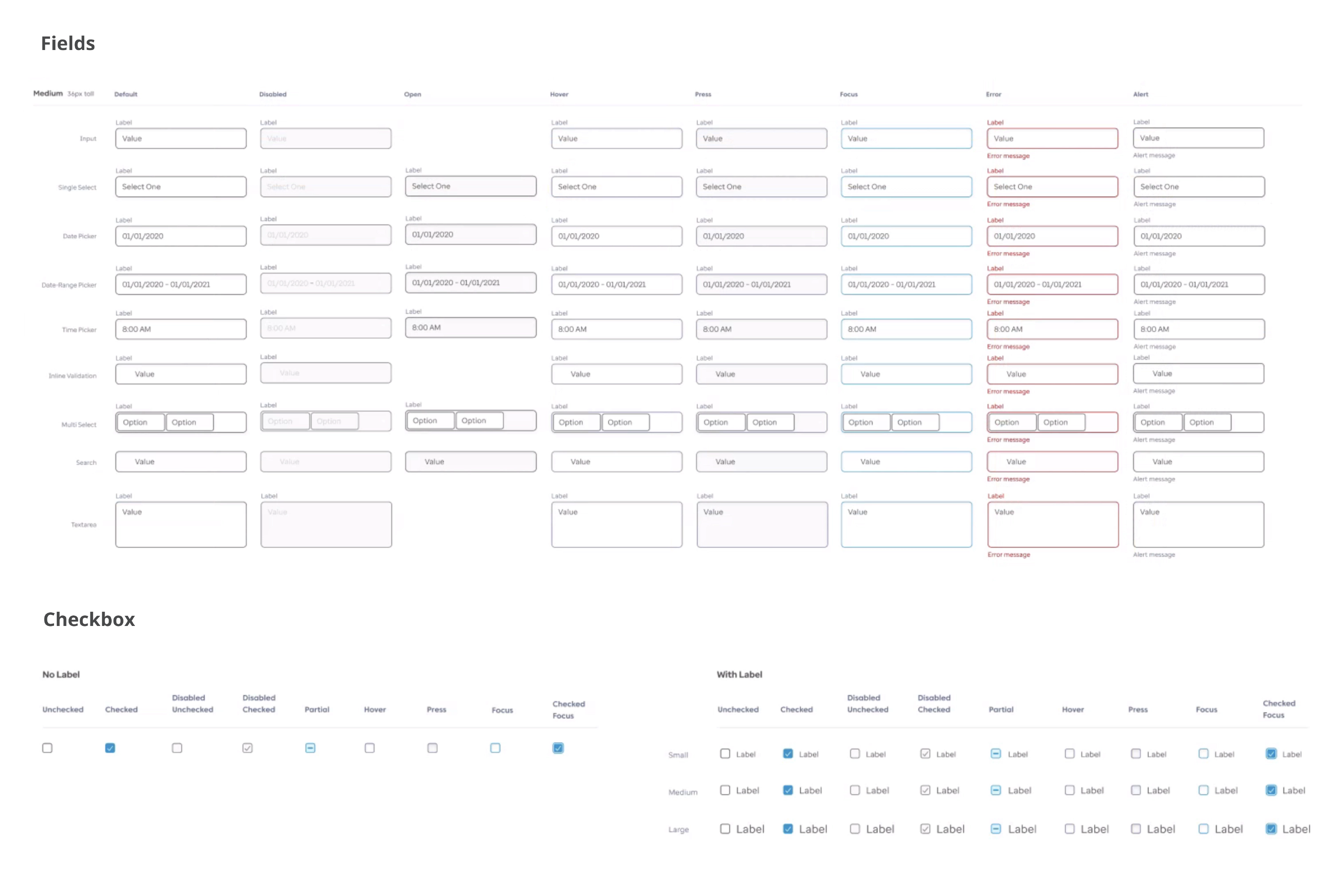
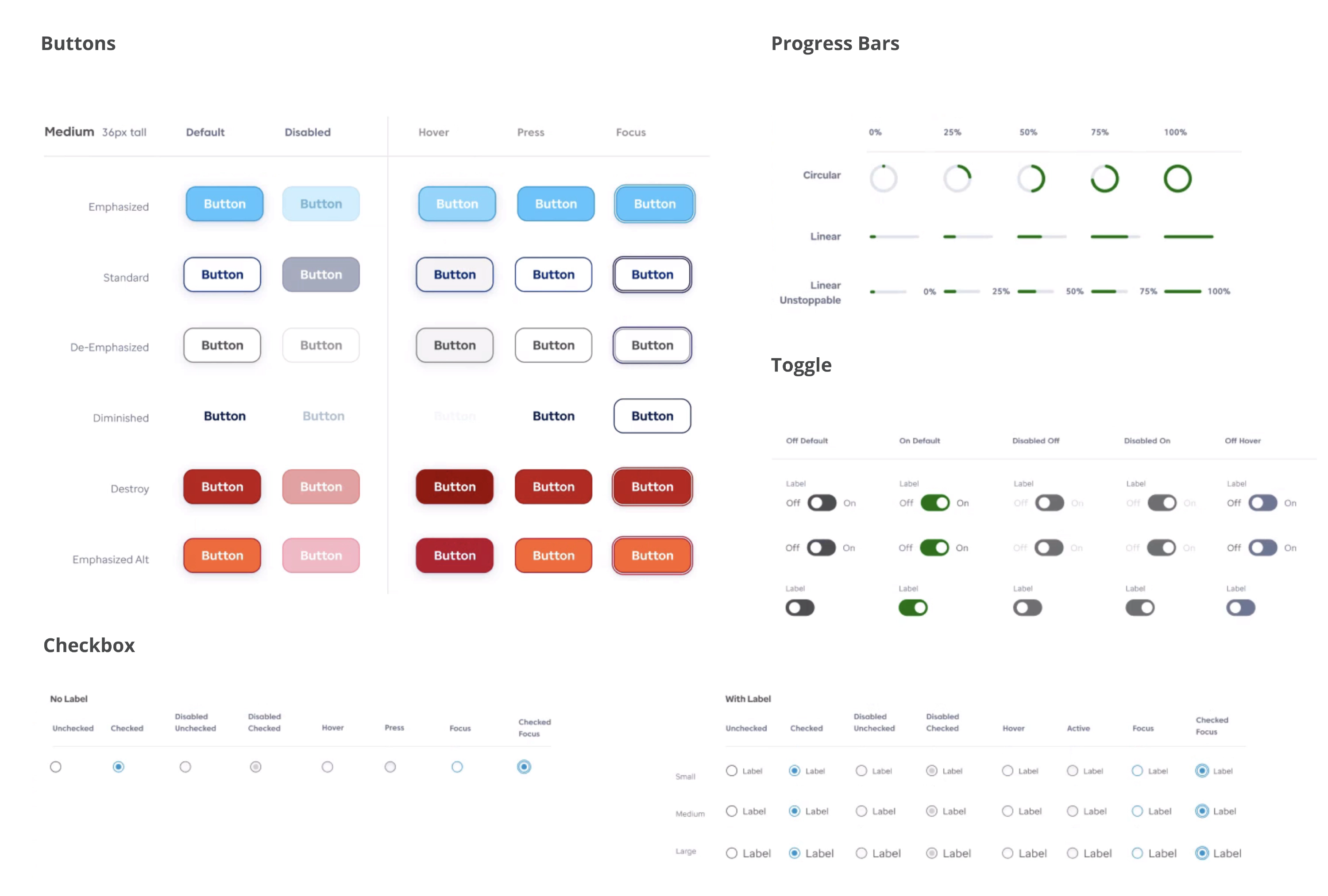
Atoms
Atoms in the system are the smallest individual elements like buttons, input boxes, badges, links.
They can be designed by combining the visual style, color, and type. Similarly, we can create other different atoms of the system.
Below I have designed the basic atoms of the product,
Molecules
Molecules are already functional elements that could be put anywhere on the page and work on their own. Components like toast messages, cards, badges, navigation, tabs, accordions make the molecules.
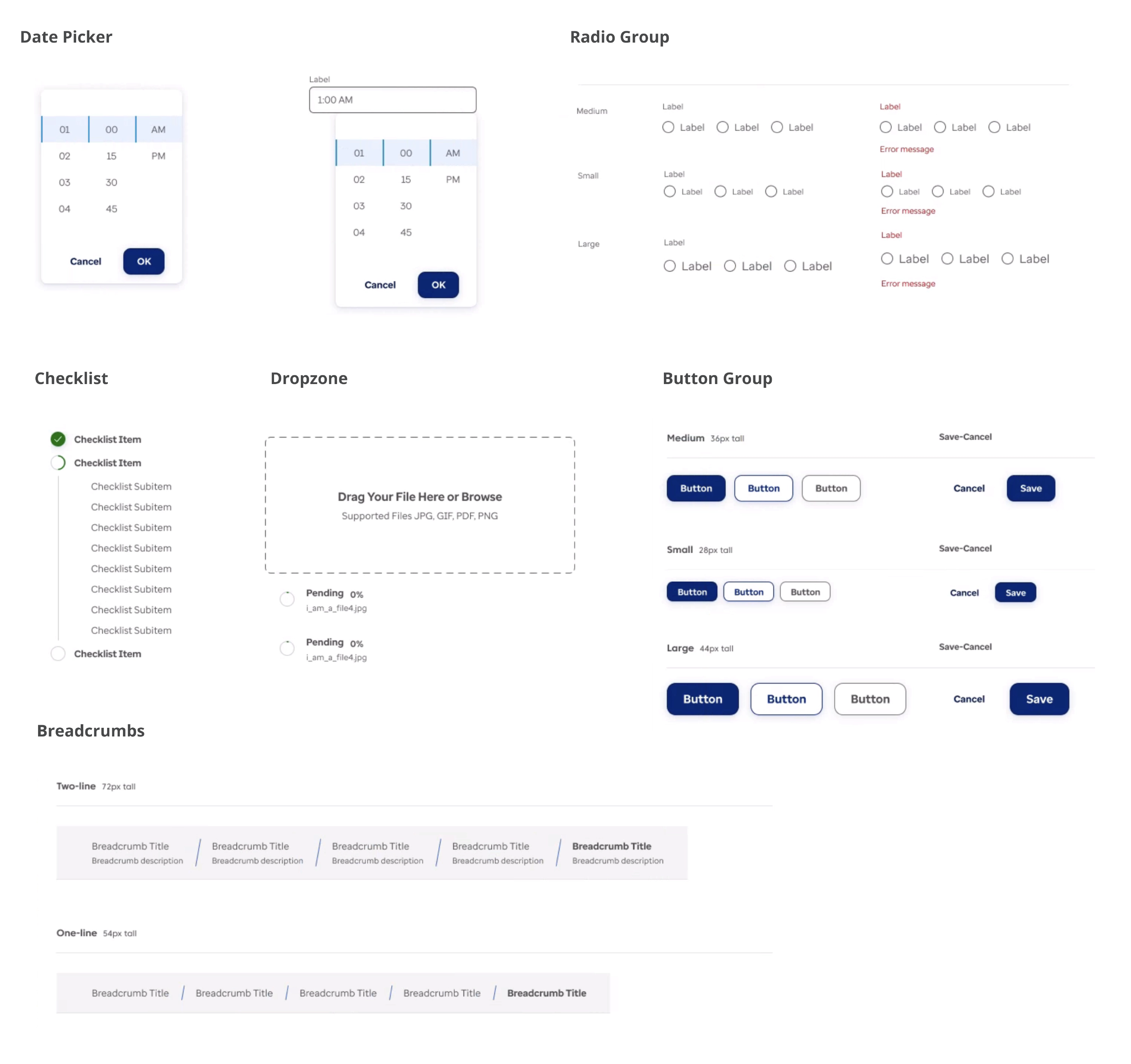
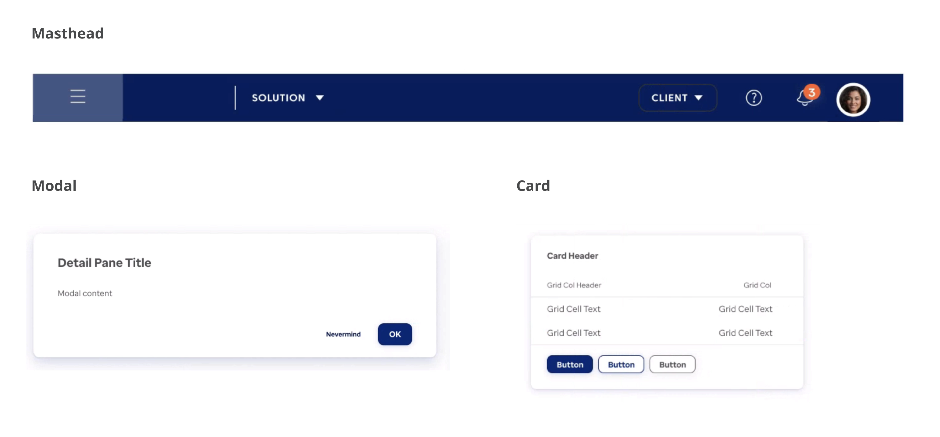
Organisms
Truly functional parts of a page, are made from groups of atoms and molecules. Many organisms function on their own, without relying on other elements on the page. They are usually huge components, like cards, navigation, headers, data tables. Organisms can become quite sophisticated and have smaller organisms inside, just like in real life.
Documentation
High-quality component documentation is crucial to an effective library allowing everyone to quickly and efficiently make consistent decisions. We wanted to create detailed documentation that would support every single aspect of our design system, and also be organized, consistent, and easy to use. We referred to several design systems such as IBM’s Carbon, Material, Atlassian, Salesforce Lightning, and other design systems for some good practices, guidelines, and tools that we could apply in our design system.

Figma Component Library
Once the Figma components are approved, we move them to a Figma Atomic Components file, a shared library of assets that our team can use to drag and drop while working on their designs.
add screenshot
Zeroheight Documentation Site
We use Zeroheight, a collaboration platform that integrates with Figma and allows product teams to create and maintain web-based design system documentation. If Figma atomic library is a library of design components, Zeroheight is a collection of guidelines and rules for those components. At a high level, most of our component documentation in Zeroheight usually includes:
- Introduction with component description
- Component construction
- Component states
- Behavior
- Best practices
- Accessibility guidelines
- Examples of components in different contexts to demonstrate how design patterns would be applied in real products and specific use cases
Storybook Components Repository
Our old repository was dated and only addressed our design system in places where we use React, which is not everywhere on the Storyblocks. We decided to build out our new repository from scratch in Storybook, a tool that allows to create an interactive pattern library for code in isolation and supports all the popular frontend frameworks. It allows to document use cases as stories and easily find, share and reuse them. Just like Figma, it also integrates with Zeroheight, making it easy to sync and align documentation between development and design. We called our new repository “Storywind”. Our plan is to eventually migrate all components from the old library into one consolidated repository.
A Figma component library and Zeroheight documentation site are excellent tools for creating a design system. Storybook components repository, a tool that allows creating an interactive pattern library for code in isolation and supports all the popular frontend frameworks, is another great tool to use. The design system is an ongoing project, and it is important to continue growing the component library, supplement it with more complex components, add sections on brand, illustrations, and animation, cultivate processes and best practices for maintaining the documentation, raise awareness across teams and promote adoption and contribution to the documentation, and build processes for testing the components on compliance with guidelines and accessibility standards.
The Future
The design system is an ongoing project. We iterate, change and learn a lot in the process. So far, we have a set of basic components ready, which has been game-changing for our team in terms of efficiency, as well as consistency, and standardization.
Some of our team’s next steps include:
- Continuing to grow our component library and supplement it with more complex components.
- Adding sections on brand, illustrations and animation.
- Cultivating processes and best practices for maintaining the documentation to ensure that our library stays up to date and perfectly in sync both on the design and code side.
- Raising awareness across the teams and promote adoption and contribution to the documentation.
- Building processes for testing the components on compliance with guidelines and accessibility standards.