Client
Change Healtcare / OptumDuration
1.5 YearsMy Role
Lead UX DesignerProblem Summary
A pharmacy technician does approximately 700 prescription data entries on a given day. The challenge became apparent when the Web App needed to facilitate remote data entry so that the pharmacy technician could spend more time attending to the patients. PDX has been a market leader in pharmacy management software and services, for over 30 years.
PDX Enterprise Pharmacy System™ (EPS™) has become the industry leader in pharmacy management systems. In the quest of moving from desktop to web, we were given the task to redesign Remote data entry for Rx Filling and patient profile call centre UI.
Business Challenge
The primary challenge involved completely overhauling the application, which would inevitably present a learning curve for existing users transitioning to the new version. Additionally, due to the system’s complexity with over 40 modules, shipping the entire application wasn’t feasible.
Implementing updates for the desktop application was no small feat. As a result, users will need to utilize four new MVP modules on the web platform while continuing to access the remaining features through the existing JAVA desktop application.
Proposed Solution to follow
-
Close collaboration with the pharmacy technicians and quick iterations lead from sketches to a working prototype of the app within a few weeks.
-
The UX team demonstrated the app to a few enthusiastic pharmacy technicians and the response was overwhelming.
-
Moving to React web based application
-
Create an entirely new task flow for the user
-
Validate it with the user via Moderated/UnModerated User Testing
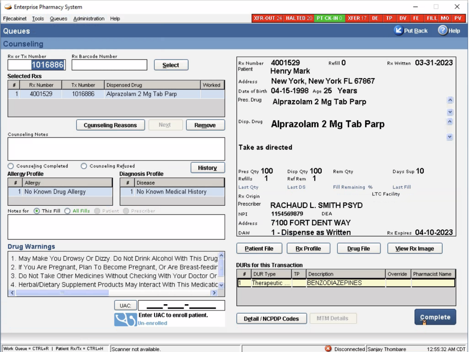
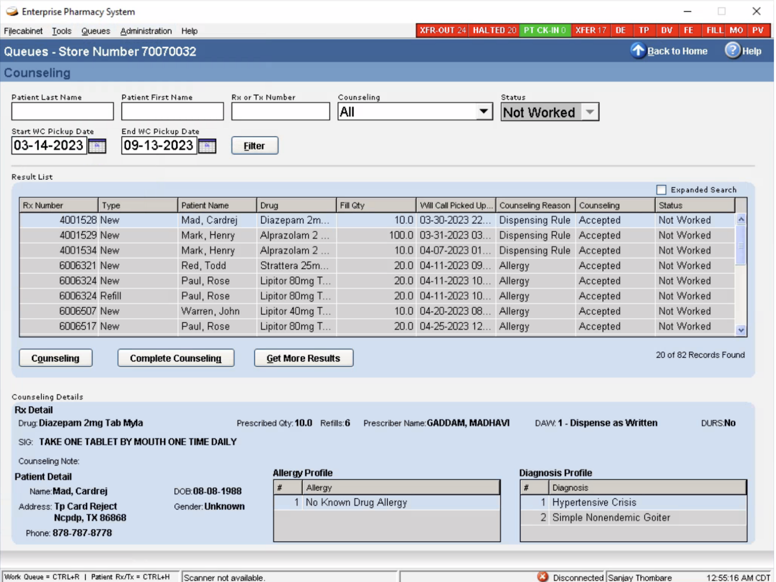
Existing System
Discovery
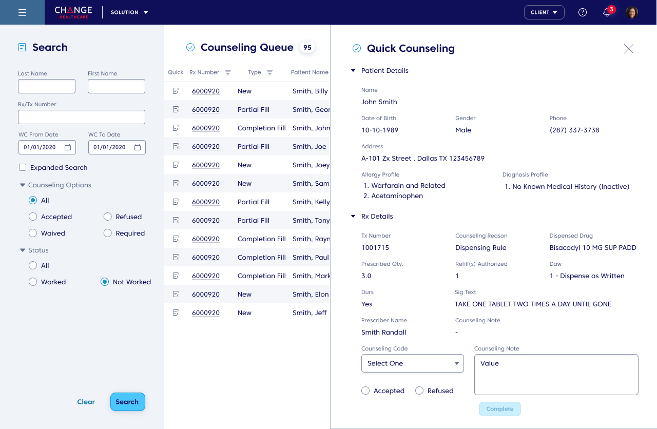
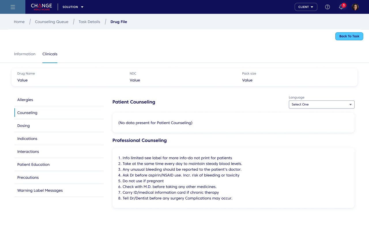
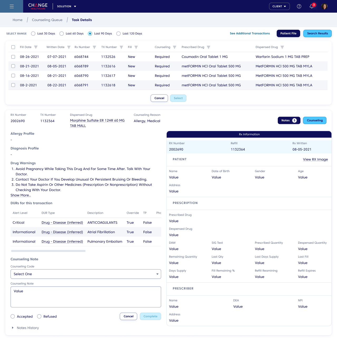
Design
Are we expecting system design for Interface design (Visual implementation only) or are we expecting workflow and functionality changes (i.e. how information structure will work/ UX)?
Are we expecting to create document template for requirement gathering?
We have been trying to create persona’s for a while now to understand the user better, as there have been instances where we haven'tbeen able to understand the user needs better.
Business model of PDX
All the products of pdx
Kinds of user roles for each product
Technology
Are we expecting to create new components from scratch? Or keeping current in place and grow
Are we restricting to particular technology while Designing and Developing components
Are we covering all the PDX products or just for Turn RX/ EPS? If yes, can we get list of all the products and some visual idea? Also the tech constraints
What is the scope of mobile design in PDX?
Are we thinking of covering Android and iPad as well
Any other tech details apart from Web/ what all browsers we are keeping in mind?
Are we expected to publish this in document format or secure portal format?
User Research
Understanding the working of a Pharmacy in the U.S

Structural Layout and Devices used in Pharacy store

User Persona

Information Architecture
-
The aim was to organize the content so that users easily adjust to the product’s functionality and find everything they need without much effort. The Information architecture goes hand in hand to create a user-friendly product with a clear navigation system.
-
One of the key aspects of IA is its role in searchability. By categorizing and labeling content effectively, I make sure that users can find what they’re looking for with minimal effort. This enhances the overall user experience and encourages engagement with the product.
-
Consistency is another important aspect of IA. By establishing consistent patterns for organizing and presenting information, I create a cohesive experience across different parts of the product. This helps users build mental models and navigate the interface confidently.

-
In the existing website user, has to go through many pages to find out drug and medical store-related information. However, in the current information structure, we have categorized the information in chunks so that findability is more precise.
-
Our pharmacy application stands out in the market with a superior IA. Users prefer applications that are easy to use and navigate, giving us a competitive edge over competitors with outdated interfaces.
-
The well-designed IA instills trust and confidence in me as a user. It shows that the business values my needs and invests in providing a high-quality user experience.
-
This new IA was validated by usign reverse card sorting method with the actual users

Compliance



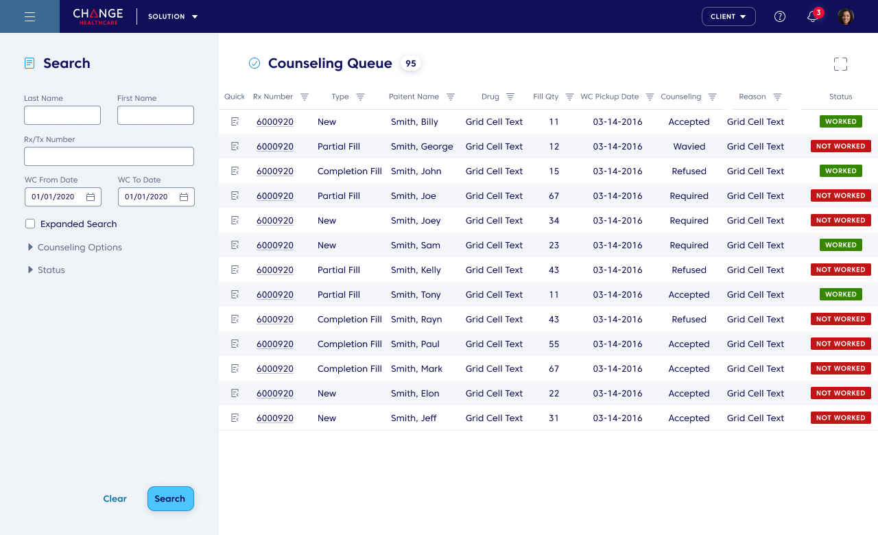
Visual Design

Some more Visual Design


Usability Testing : Remote
