As the digital world becomes increasingly integral to our daily lives, it’s crucial that User Experience (UX) design embraces diversity—including cognitive diversity. Neurodiversity refers to the concept that neurological differences like autism, ADHD, dyslexia, and other cognitive variations are natural, and should be recognized and respected like any other human diversity.
Designing for cognitive accessibility means creating user interfaces that accommodate different thinking styles, processing speeds, memory capacities, and communication preferences. This post explores essential resources and strategies to create accessible experiences for neurodivergent individuals, ensuring your digital products are usable by as many people as possible.
Understanding Neurodiversity in UX
Neurodiversity recognizes that cognitive conditions are part of the natural variation in human brains. While many people think of accessibility in terms of physical disabilities, cognitive accessibility is often overlooked, yet it’s a crucial part of inclusive design.
Neurodivergent users may experience challenges like:
- Difficulty with focus and distraction (ADHD).
- Challenges in interpreting social cues or complex instructions (autism).
- Issues with short-term memory (dyslexia, ADHD).
- Sensory sensitivities (autism, anxiety).

Posters showing the dos and don’ts of designing for users with accessibility
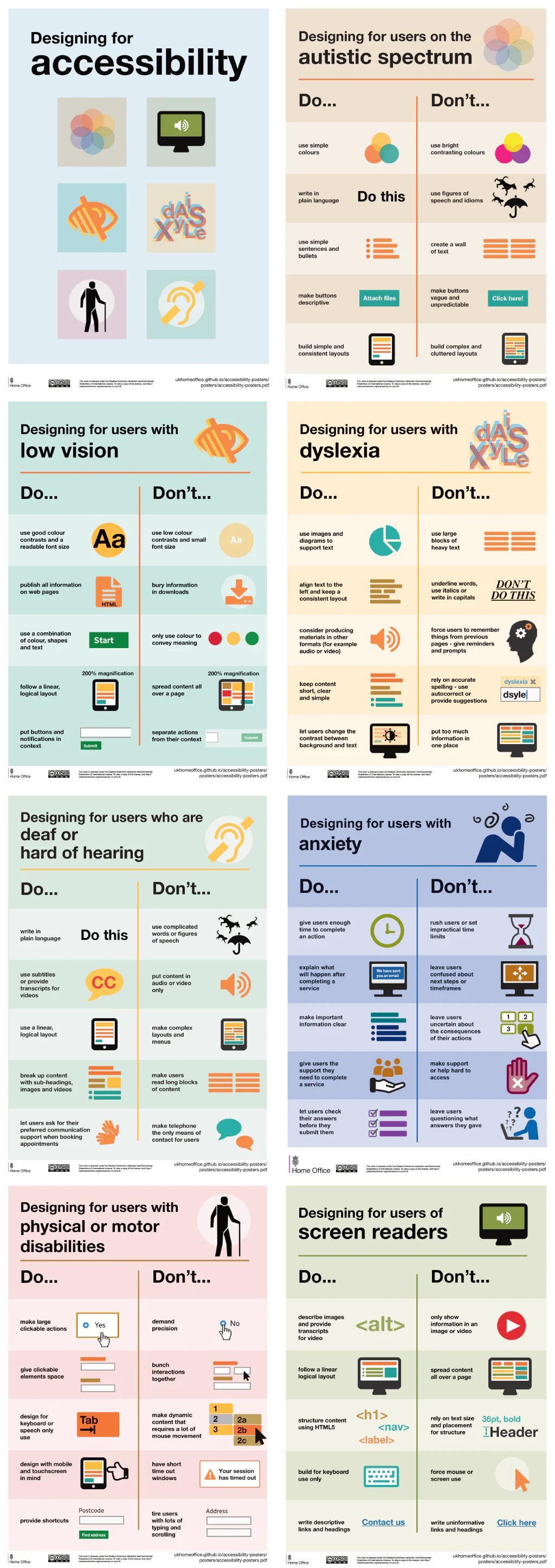
The UK government has a nice list of posters with best practices, including some specific for autistic spectrum and dyslexia Dos and don’ts on designing for accessibility. These posters are availabel free on Github.
Essential UX Principles for Cognitive Accessibility
1. Clarity and Simplicity
- Reduce Cognitive Load: Avoid overwhelming users with complex interfaces. Split tasks into smaller, manageable steps, and present information in bite-sized chunks.
- Simple Language: Use clear, straightforward language. Avoid jargon or overly technical terms. For example, instead of “Authenticate your credentials,” use “Sign in.”
- Avoid Information Overload: Limit the number of interactive elements on a page. Users should only see what is relevant for the task at hand, which helps avoid distractions and cognitive overload.
2. Consistent and Predictable Navigation
- Standard UI Patterns: Use familiar UI patterns that users will intuitively understand. Consistency reduces the mental effort needed to learn how to use the interface.
- Clear Hierarchies: Create a visual hierarchy using size, color, and positioning to guide users’ attention effectively.
- Descriptive Links and Buttons: Label links and buttons clearly so users know what will happen if they click. For instance, “Learn more about our services” is more informative than simply “Click here.”
3. Support Focus and Attention
- Minimize Distractions: Remove or minimize elements that could distract users, such as pop-ups, moving animations, or autoplay videos.
- Allow Customization: Allow users to adjust settings to suit their preferences, such as changing font size, enabling a distraction-free mode, or hiding unnecessary elements.
4. Readable and Understandable Text
- Adjustable Fonts: Support scalable fonts to help users who have difficulty reading smaller text. Provide enough line spacing to prevent text from looking cluttered.
- Readable Fonts: Use fonts that are easy to read. Sans-serif fonts like Arial or Verdana are often preferable because they are cleaner and more accessible.
- Short Paragraphs: Break text into short paragraphs and use bullet points where possible. This makes it easier for users to scan content.
5. Provide Multiple Ways to Consume Information
- Text Alternatives: Provide alternatives for non-text content. Use text descriptions for images and provide transcripts for video and audio content.
- Visual and Verbal Cues: Pair visual cues (such as icons or images) with text to support comprehension. This is helpful for users who process information better visually.
- Multiple Communication Channels: Offer multiple contact options—such as chat, email, and phone support—since different users may be comfortable with different modes of communication.
6. Error Prevention and Recovery
- Form Validation and Feedback: Offer real-time form validation to prevent errors, and ensure that error messages are easy to understand and actionable. For instance, “Enter a valid email address” is more helpful than “Error 105.”
- Undo Options: Allow users to undo actions easily. This reduces anxiety for users who may be prone to clicking the wrong button or making mistakes.
7. Visual Design and Sensory Considerations
- Avoid Sensory Overload: Avoid overly bright colors, flashing animations, or crowded designs, as these can be overwhelming for neurodivergent users with sensory sensitivities.
- Use Calm and Soothing Colors: Opt for soft color palettes and provide options for users to switch themes if necessary.
- Consistent Icons: Use consistent iconography throughout the site, making it easier for users to recognize and understand functions.
8. Testing with Neurodivergent Users
- Involve Neurodivergent Users in Testing: When developing digital products, involve neurodivergent users in usability testing. Their feedback can help identify specific pain points and areas where improvements are needed.
- Iterative Testing: Design should be a continuous process. Regularly test with a diverse range of users to ensure accessibility needs are being met as the product evolves.
Designers should aim to create user interfaces that are friendly to these needs without alienating neurotypical users.
Tools and Resources for Designing Cognitive Accessibility
Neurodiversity Design System
offers tips for learning management systems, some of those might apply to more generic interfaces and help you make them more accessible.
Choosing Kinder Design
Offers excellent resources for understanding how to design inclusively.
Cognitive Disabilities and the Web
Create or reference checklists that include key aspects of cognitive accessibility—ensuring that your product considers readability, focus, memory load, etc.
Conclusion
Designing for neurodiversity is a crucial aspect of building truly inclusive digital experiences. By incorporating cognitive accessibility principles, you create environments where everyone, regardless of their cognitive differences, can interact effectively and comfortably with your products.
Whether it’s simplifying navigation, providing customizable settings, or minimizing distractions, these changes can make a big difference for neurodivergent users. As UX designers, it’s our responsibility to ensure that no user is left behind—and that means embracing and designing for all types of human diversity, including those who think and experience the world differently.
Are you incorporating cognitive accessibility into your UX design processes? Start today by implementing these strategies and taking steps toward building more inclusive products. Remember, accessibility is not an afterthought—it should be integral to every part of the design process. Let’s make the web a more accessible place for everyone!