s In the world of web design, accessibility is paramount. One crucial aspect of accessibility is color contrast, which ensures that text is readable against its background. For years, designers have relied on the Web Content Accessibility Guidelines (WCAG) 2.0 contrast ratios. However, a new algorithm is changing the game: the Advanced Perceptual Contrast Algorithm (APCA).
What is Advanced Perceptual Contrast Algorithm (APCA)?
APCA, developed by the W3C Silver Task Force, is a cutting-edge approach to calculating color contrast. It aims to address the limitations of traditional methods and provide a more accurate representation of how humans perceive contrast.
Key Features of APCA:
1. Context-sensitive contrast evaluation
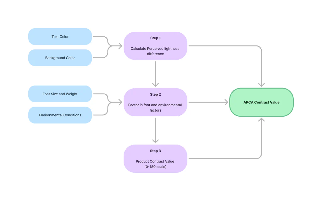
- APCA considers font size and weight, recognizing that larger, bolder text requires less contrast to be readable.
- It accounts for ambient light conditions, acknowledging that contrast perception changes in different environments.
2. Improved accuracy for real-world scenarios
- APCA aligns better with human perception, providing more realistic assessments of readability.
- It offers more precise predictions of how users will experience contrast in various situations.
3. Expanded color range
- The algorithm accommodates a wider gamut of colors, allowing for more design flexibility.
- Designers can explore more creative color combinations while still maintaining accessibility standards.

How APCA Works:
Benefits of Using APCA:
- Enhanced readability across various devices and environments
- More accurate representation of how people perceive contrast
- Allows for more creative design choices while ensuring accessibility
- Future-proofs designs for evolving accessibility standards
Implementing APCA in Your Designs:
- Use APCA calculators or plugins for design tools to evaluate color combinations.
- Consider APCA values when choosing text and background colors.
- Test designs across different device types and lighting conditions to ensure consistent readability.
Challenges and Considerations:
- There’s a learning curve for designers accustomed to traditional contrast ratio methods.
- APCA has limited adoption in current accessibility guidelines, though this is changing.
- Existing designs may need updates to comply with APCA recommendations.
Future of APCA:
- Ongoing research and refinement of the algorithm continue to improve its accuracy.
- APCA may be included in future WCAG standards, potentially becoming the new norm.
- More designers and developers are adopting APCA, recognizing its benefits for accessibility.
Here are some websites and Figma plugins where you can test and work with APCA contrast:
Websites:
APCAcontrast.com
This is the official APCA contrast calculator developed by the algorithm’s creator, Myndex Research.
ColorA11y.com
Offers both WCAG 2 and APCA contrast checking tools.
Contrast Tools
While primarily using WCAG 2.0, it also includes APCA calculations.
Polypane Browser
A developer-focused browser that includes APCA in its accessibility testing suite.
Figma Plugins:
A11y - Color Contrast Checker
This plugin supports both WCAG 2.0 and APCA contrast checking.
Contrast
Offers APCA calculations alongside traditional contrast ratios.
Able – Friction free accessibility
Includes APCA in its comprehensive set of accessibility checking tools.
Color Contrast Analyzer
Recently updated to include APCA alongside WCAG 2.0 contrast checks.
When using these tools, keep in mind:
-
Some tools may use different versions of the APCA algorithm, so results might vary slightly.
-
APCA is still evolving, so it’s a good idea to check for updates regularly.
-
While these tools are helpful, they don’t replace the need for user testing and considering other accessibility factors.
-
When using Figma plugins, make sure to keep them updated for the most accurate results.
-
Consider using multiple tools to cross-check your results and get a comprehensive view of your design’s accessibility.
By incorporating these tools into your workflow, you can ensure that your designs meet both traditional and emerging accessibility standards, creating more inclusive digital experiences for all users.
Conclusion:
APCA represents a significant leap forward in ensuring web accessibility through improved color contrast evaluation. By considering factors like font properties and environmental conditions, it provides a more nuanced and accurate assessment of readability. As we move towards more inclusive design practices, APCA stands out as a powerful tool in creating websites that are truly accessible to all users.
We encourage you to explore APCA and implement it in your projects. Share your experiences with this new algorithm and how it has impacted your design process. For further learning, check out the W3C’s documentation on APCA and try out some of the available APCA calculator tools.
By embracing APCA, we can create a more accessible and inclusive web for everyone. Let’s lead the charge in adopting this revolutionary approach to color contrast!